Dark mode is definitely what I'd consider a nice to have feature. If your app provides enough value, dark mode is not essential. You aren't going to lose customers by not having it. So when I first started Metorik in 2016, I didn't even consider it.
Then a couple years later, it was 2018 and everyone was talking about dark mode. As operating systems and browsers made it easier to detect and implement dark mode, more and more apps started adding it. Personally, I love it. Maybe that's the developer in me speaking. But really, for those of us looking at devices for 12+ hours a day, dark mode quickly becomes essential.

As I touched on before, dark mode isn't what gets customers. Providing a valuable, efficient software solution to a business' problem is what does. So I let it slip away to the back of my mind, knowing that our time was better spent elsewhere. That didn't stop the customer requests though, and I knew it would be a necessary addition at some point.
A few weeks back, I found myself logging into Metorik quite early in the morning, and suddenly realised how bright the app was. I took it as a sign. I opened up the Chrome developer console, and started changing background colors. It was more out of curiosity than anything. Could the app be functional and look good in dark colors? But as I began to modify the CSS, I found it was definitely possible, and actually, quite fun to add.
Last week, we launched dark mode for Metorik, and the feedback has been very rewarding. I thought it might be fun to write a bit about the process of implementing dark mode, especially in the context of adding it to a large, mature SaaS app.
This guide won't talk too much about what colors to use or how to think about designing a dark mode, but will include some example CSS and JavaScript required to implement it.
The Process
First I dived into the countless dark mode articles out there. Some of my favorites included this summary on web.dev and a guide on Section.
Our goal with adding dark mode was to make it seamless, both for users with dark mode enabled on their device, and those who prefer light mode.
There's an easy way to add CSS that only applies when someone has dark mode on:
But this becomes a problem very quickly. What if someone has dark mode enabled on their device, but wants to use the light mode version of your app? Especially if your app has been around for years, users will often prefer to stick with the light mode they're used to.
We found this to be the case after releasing dark mode, where lots of our users who had dark mode enabled on their device chose to use light mode in Metorik, as they didn't want a change.
Similarly, you may have a user who has their computer in light mode, but wants to see the app in dark mode.
So then the preferred method is to add a class to the body, such as dark, and then have CSS that makes dark mode changes but only when the dark class exists:
So now I had a way to add CSS that would only apply when the dark class was on the body.
Next up was adding a way to switch between color modes easily.
I was inspired by the selector in the Tailwind CSS docs:
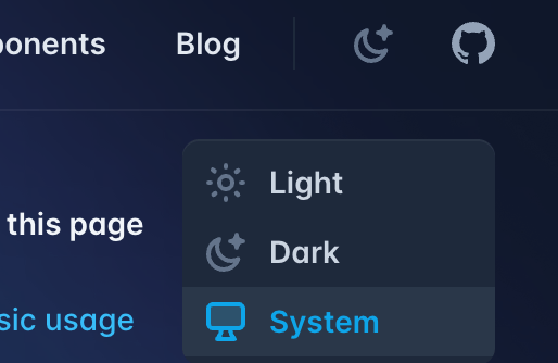
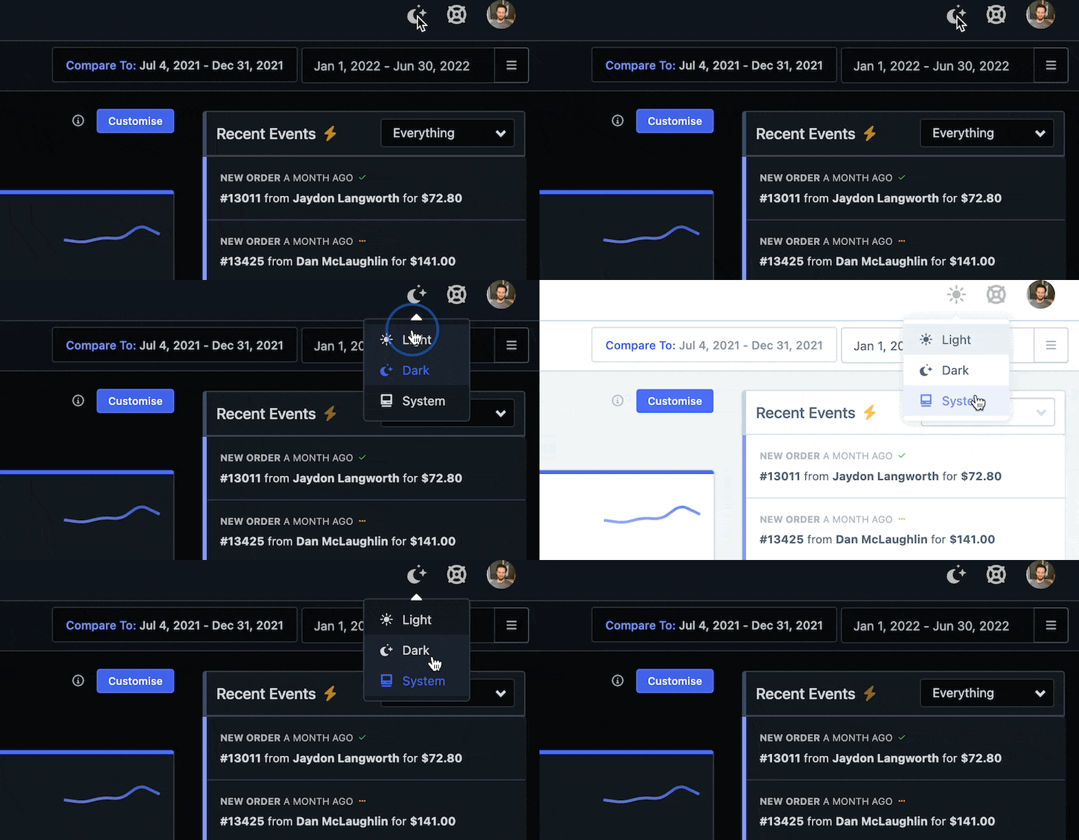
So I decided to go for something similar, with the ability to switch between a manual Light mode, a manual Dark mode, and using your System setting. It's useful to have the System option as most devices can switch between dark and light mode automatically (eg. light mode during the day, dark mode during the night), so by using system, you can switch the app color mode automatically.
This is what we ended up with:
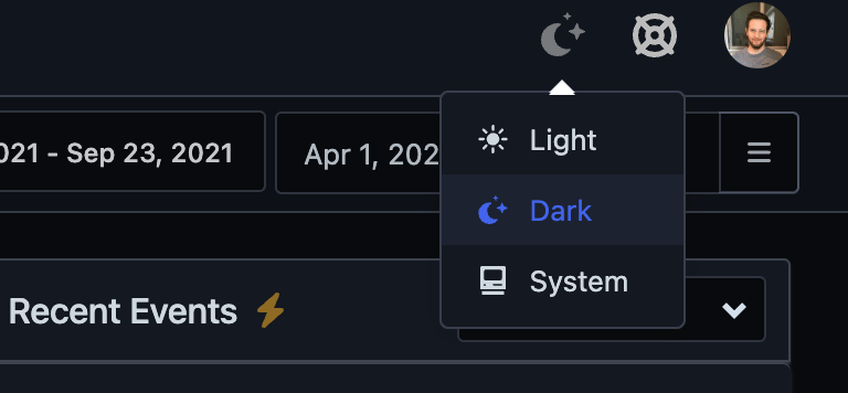
When a user changes their setting, we store that under their user profile so it remembers it next time, even if they use a different device. Here's a GIF of this switcher in action:
If they've chosen System, you need a way in JS to tell what their device setting is. This is where the CSS from above comes in handy, but in a different way:
The next part is having some JS that adds the dark class to the body element whenever the user has dark mode enabled, or when they turn it on. But it also has to remove the dark class if not (in case switching from dark to light mode).
But here's a twist. We actually need to add the dark class to the :root HTML tag, for a reason I'll explain later. This code does it for both the body and the :root:
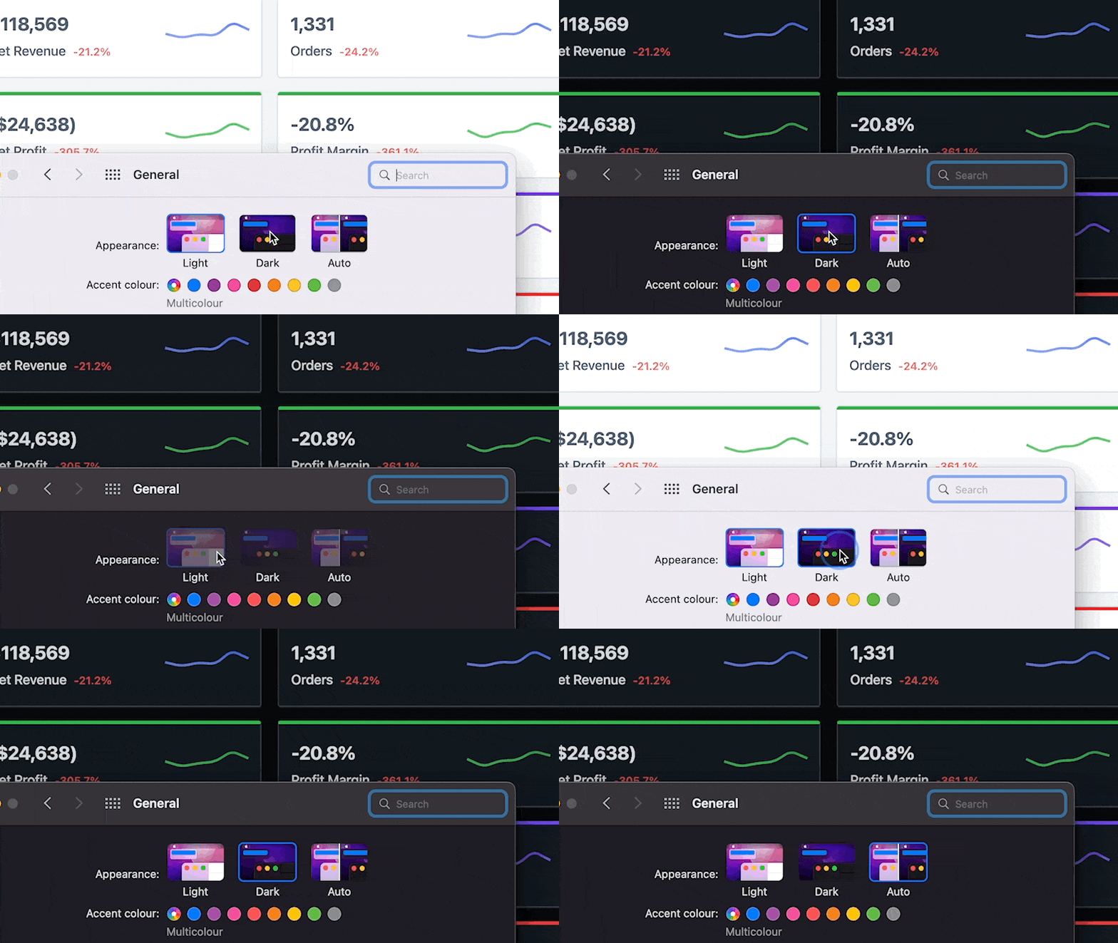
The final part is detecting when the system color mode changes, so you can apply the code above to add the dark class automatically if they've chosen System. Importantly, some older browsers like Safari 13.x have issues with adding an event handler, so we'll check the function exists before trying:
This looks a bit like this in practice:
While CSS will help you switch most of your app to dark mode, browser elements like select forms, scroll bars, etc., also need to be changed based on the user-defined color mode. To do that, we need to add some CSS that applies to the :root element. Since we're adding a dark class to it using the above code, this is all that's needed:
Final Thoughts
Adding dark mode to an existing SaaS app should be done thoughtfully. The goal is to make the app better, but depending on how you do it, it could make it worse if it comes as a surprise or there's no easy way to opt-out.
One last minute addition I made was a popup, that would get shown the first time we detected their System was set to dark mode:
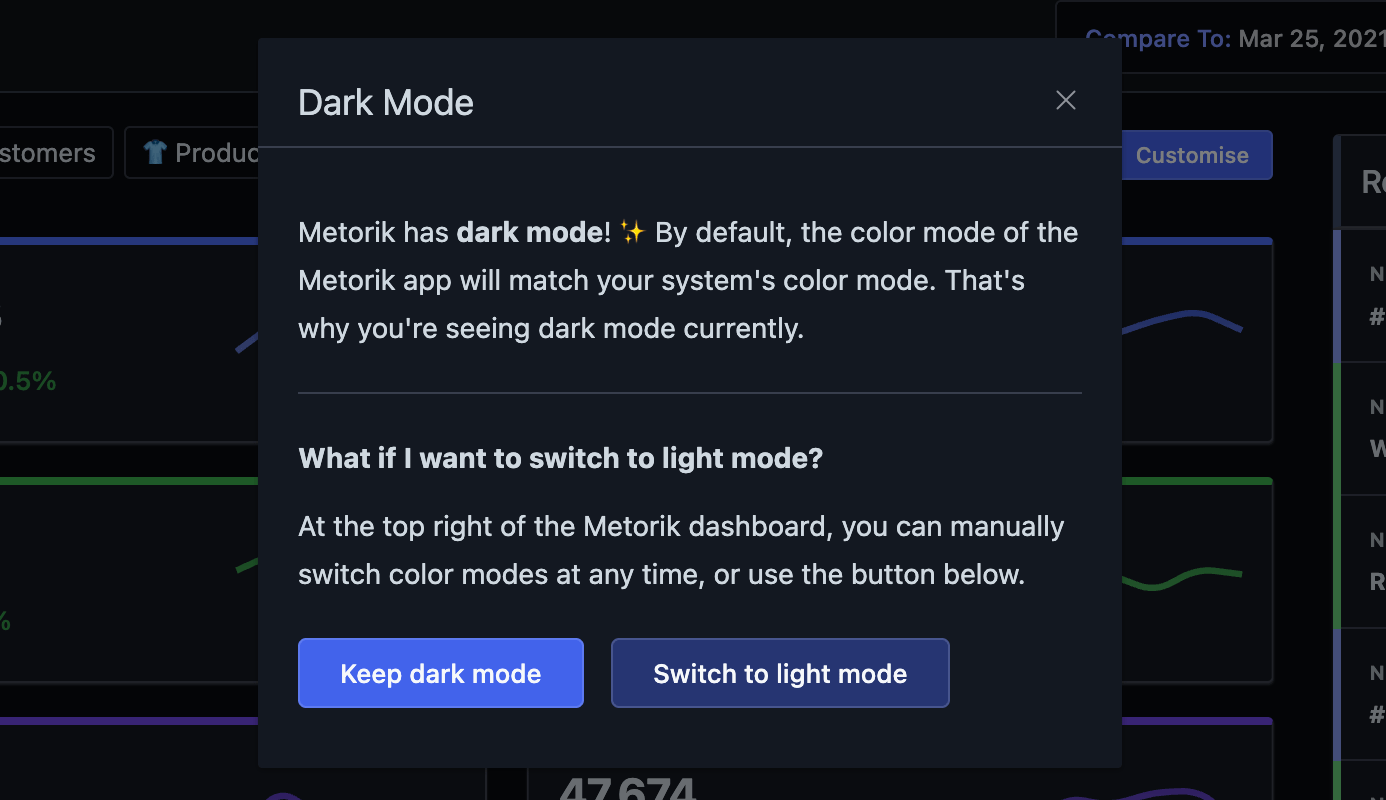
I highly recommend doing the same if you're implementing dark mode to an existing app.
For more dark mode inspiration, check out our release post where I included a few screenshots of the app in dark mode.
