A New Logo for Metorik
This week, 2 years ago, Metorik was officially launched. It was a Wednesday night down here in Melbourne, Australia, and for some reason, I thought it was a good idea to put it all live at 11.30pm before going to bed.
You see, I'd been working on it for over 2 months, non-stop, with virtually no sleep, so I was pretty desperate to hit the 'live' button. It probably had around 5% of the features it has today, but I wasn't prepared to wait any longer.
Likewise, when it came to designing a logo in those early days, it didn't seem practical to pay a designer $1000's (that I didn't have) or spend days trying to make something incredible myself. Instead, I opened up Sketch, drew a circle with a gradient border, put a chart icon/arrow in it, and used that.
This is what it looked like:


And it worked, for a good couple years.
Lately though, I've been longing for a bit more polish. I've wanted a logo that had slightly more meaning. A logo that was scientific, in that the way it was formed had a formula and calculation behind it. A logo that could grow with Metorik, but also showed how far it had come.
So a couple of days ago, we sat down and started sketching. We aren't great sketchers.
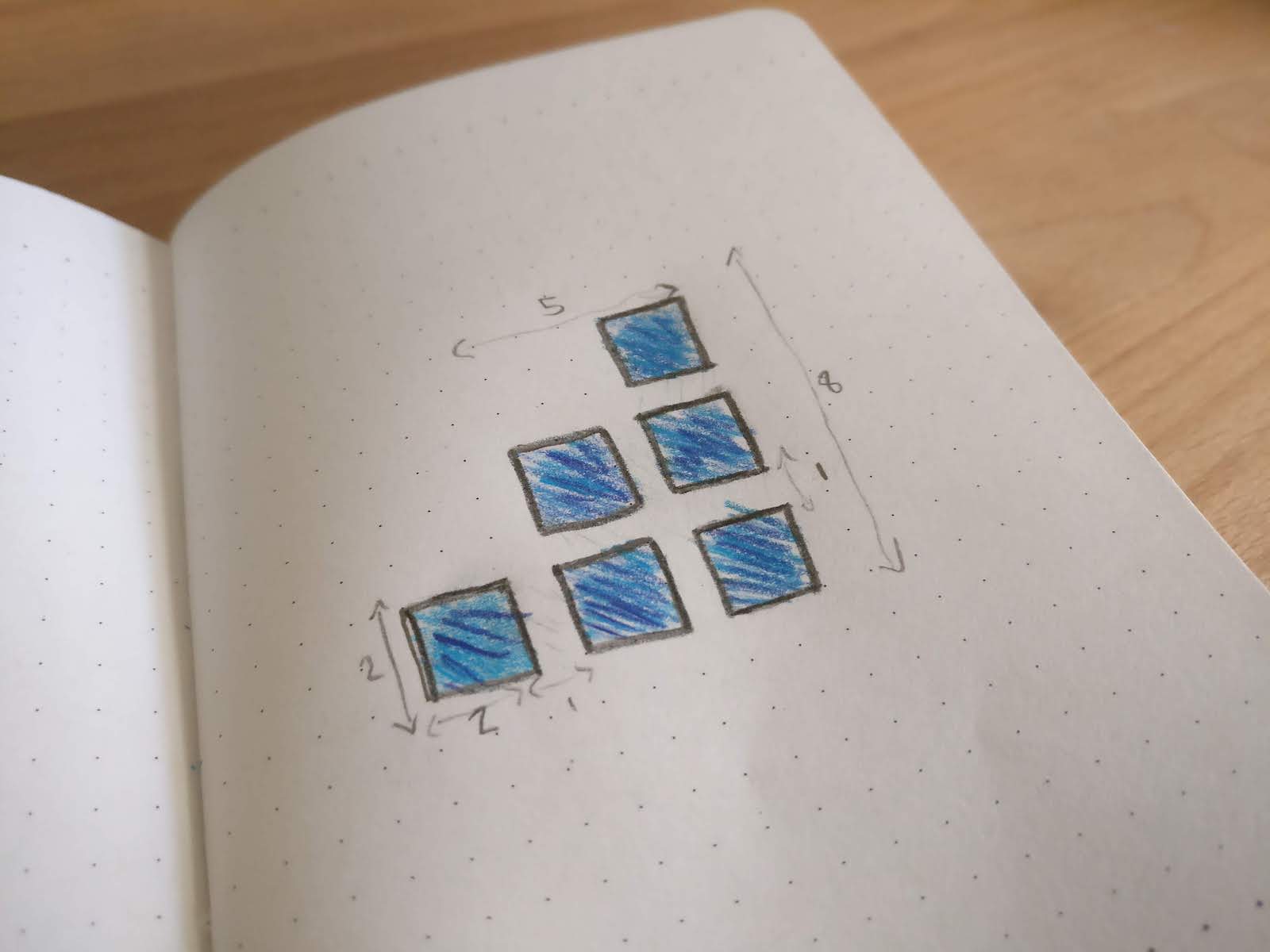

But it was starting to feel like an idea. So the next step was opening up my beloved Sketch, and putting those sketches into digital form. First, as squares, with a bit of gradation:


And then, adding the Metorik indigo I so very love: #4C6EF5. But also playing with the border radius, giving it a slightly rounded corner and also an infinitely rounded corner:


It was starting to feel like a logo. But the gaps between each 'square' were too small. We tried making it smaller, and smaller, and even negative:
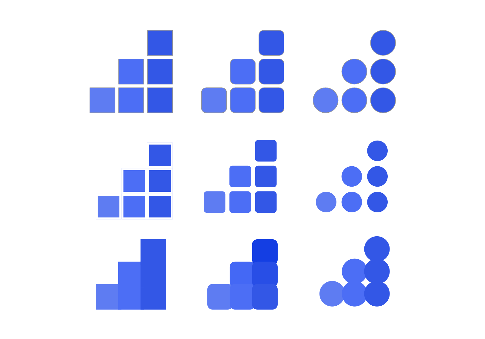

Yep, that was the right decision. And that led us to the final version, which looks a bit like this:
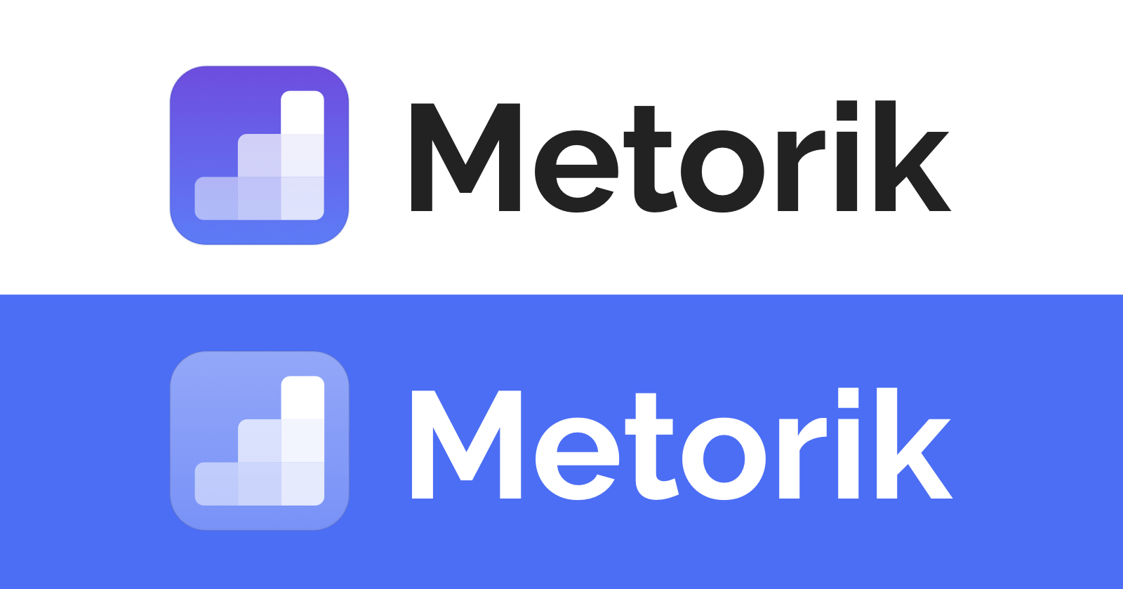

One of the things I love about the logo is how much fun you can have with the background behind the 'steps':


I hope you enjoyed this overview of designing Metorik's new logo. As a final note, I have immense respect for all professional logo designers out there - designing a logo is no easy feat. I think I'll go back to my code editor now!
PS. You can download and read more about the new logo on the Metorik Brand page.


